You've spent hours building the perfect spreadsheet. VLOOKUP formulas that would make an accountant weep. Pivot tables that actually pivot. Conditional formatting that highlights exactly what matters. And then someone asks: "Can we see this as a chart?"
So you copy-paste into PowerPoint. Or screenshot it for Slack. Or—if you're feeling ambitious—build a dashboard in Tableau that breaks every time the column order changes.
The Truth: The data you need is already in spreadsheets. The insights you want are just visualization away. The problem isn't your data—it's the 47 manual steps between "I have a spreadsheet" and "I have a dashboard."
From Rows to Visualizations in One Click
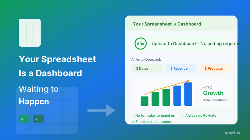
Upload your Excel file. Or paste your Google Sheets link. That's it. Grey8's AI reads your columns, understands your data types, infers relationships, and generates an interactive dashboard automatically.
Not a template. Not a blank canvas asking you to configure chart types. An actual dashboard with the right visualizations for your specific data—time series charts for dates, bar charts for categories, KPI cards for metrics, scatter plots for correlations.
Smart Column Detection That Actually Works
Your "Revenue" column isn't just numbers—it's currency. Your "Created_Date" column isn't just text—it's a time series. Your "Customer_ID" column isn't a metric to sum—it's a dimension to group by.
Most tools make you specify this manually. Grey8's AI infers it automatically by analyzing column names, data patterns, and value distributions. It knows the difference between a "Customer Count" (display as-is) and a "Customer ID" (count distinct values). Between a "Date" (x-axis) and a "Day of Week" (category).
Grey8 Advantage: Semantic understanding, not just data types. We don't just see "string" and "number"—we understand revenue, churn, conversion rates, and customer cohorts.
Live Google Sheets Connection
The best dashboards update themselves. Connect your Google Sheets URL, and your Grey8 dashboard reflects changes in real-time. No re-uploading. No sync buttons. Just a living dashboard that stays current as your spreadsheet evolves.
Your team keeps working in the tool they know—Google Sheets. Your stakeholders see insights in the format they need—visual dashboards. No migration. No training. No workflow disruption.
Share Without the Chaos
Sharing a spreadsheet means giving someone edit access to 47 tabs of formulas, asking them to scroll to row 483, and hoping they don't accidentally delete the pivot table. Sharing a Grey8 dashboard means sending a link to an interactive visualization with filters, drill-downs, and export options—while your source spreadsheet stays protected.
Pro Tip: Generate public dashboard links for board meetings or client reports without exposing your raw data or formulas. Stakeholders see insights, not implementation.
Combine Multiple Sources Instantly
Your revenue is in one spreadsheet. Your costs are in another. Your customer data is in a third. Building a unified dashboard traditionally means hours of VLOOKUP hell or learning SQL joins.
Grey8 lets you upload multiple spreadsheets and automatically suggests join keys based on column similarity. Combine your Stripe export with your ad spend tracker with your support ticket log—all without writing a single formula.
Stop Maintaining Formulas, Start Seeing Insights
Every time your data structure changes, your formulas break. A new column throws off your VLOOKUP index. A renamed sheet breaks your INDIRECT reference. A sorted range scrambles your MATCH function.
Grey8 dashboards adapt automatically. Add a new column? It appears in your filters. Change a data type? Visualizations update. Rename a field? Semantic AI maps the change. You maintain your data. We maintain your dashboard.
From Static Cells to Living Dashboards
Your spreadsheet already contains the insights you need. The revenue trends. The customer patterns. The operational bottlenecks. They're just trapped in rows and columns, invisible until someone has time to build charts manually.
Grey8 turns every spreadsheet into an interactive dashboard—automatically, instantly, and intelligently. No BI training. No data engineering. Just upload your file and see what your data is trying to tell you.
Because the best dashboard is the one that already exists in your spreadsheet. It just needs the right tool to bring it to life.