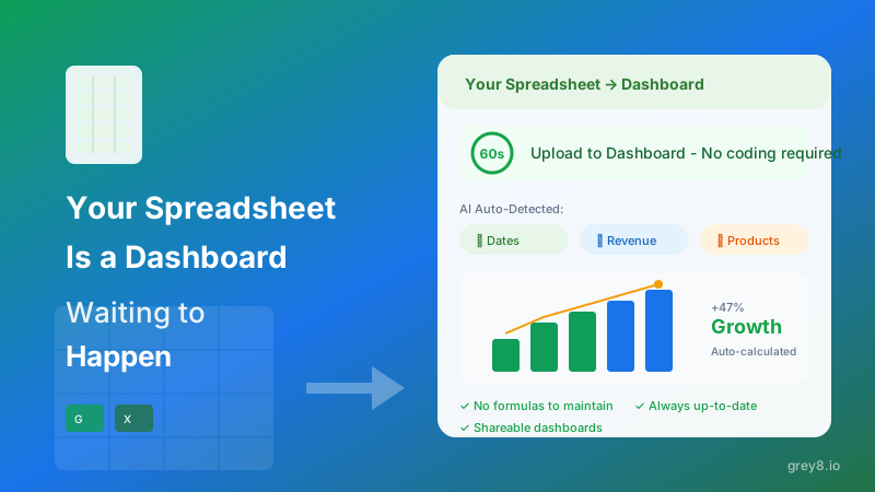
Upload a CSV. Get a dashboard. Sixty seconds, zero configuration. That's the Grey8 promise. But behind that simple interface is a complex AI pipeline that makes thousands of inferences about your data—data types, relationships, business context, visualization priorities, and layout optimization.
This is the technical story of how we built it.
Context: This article assumes familiarity with LLMs, embedding models, and modern web architectures. If you're building similar AI-powered data tools, this is a roadmap. If you're evaluating Grey8's technical approach, this is transparency.
Architecture Overview
Our dashboard generation pipeline has five stages, each with distinct AI and deterministic components:
- Schema Inference - Understanding data types, constraints, and column semantics
- Semantic Understanding - Mapping columns to business concepts using embedding similarity
- Chart Selection - Choosing optimal visualizations based on data characteristics and analytical intent
- Layout Optimization - Arranging charts for visual hierarchy and narrative flow
- Rendering & Interactivity - Generating production-ready React components with drill-down capabilities
The entire pipeline runs in under 10 seconds for datasets up to 100K rows. Here's how each stage works.
Stage 1: Schema Inference
Traditional BI tools rely on explicit schema definitions—you tell the tool what each column means. We infer it automatically by combining statistical analysis with LLM-powered semantic interpretation.
Statistical Type Detection
First pass: pandas-based heuristics. We sample the first 1000 rows and check:
- Data type distribution (numeric, string, datetime, boolean)
- Cardinality (unique value count vs. total rows)
- Nullability patterns
- Value range and statistical moments for numeric columns
- Regex patterns for common formats (emails, URLs, IDs, currency)
This gives us syntactic types: "This column is numeric with high cardinality" or "This column is string with 7 unique values."
Semantic Type Enrichment
Second pass: LLM inference. We send column names, sample values, and statistical summaries to GPT-4 with a structured prompt:
Prompt Engineering Insight: We don't ask "What is this column?" We ask: "Is this a metric, dimension, identifier, or temporal field? If metric, what unit? If dimension, what granularity?" Structured questions yield structured answers.
The LLM returns JSON with semantic tags:
{
  "revenue": {
    "role": "metric",
    "unit": "currency_usd",
    "aggregation": "sum"
  },
  "customer_id": {
    "role": "identifier",
    "aggregation": "count_distinct"
  },
  "signup_date": {
    "role": "temporal",
    "granularity": "day"
  }
}
This semantic layer is critical. It's the difference between a dashboard that sums Customer IDs (nonsense) and one that counts distinct customers (insight).
Stage 2: Semantic Understanding via Embeddings
Not all "revenue" columns are named "revenue." Some are "total_sales," "mrr," "arr," or "收入" (Chinese). We need semantic similarity, not string matching.
We maintain a vector database of ~500 canonical business concepts—common metrics, dimensions, and KPIs across finance, marketing, sales, and operations. Each concept has:
- A primary name ("Monthly Recurring Revenue")
- Common aliases ("MRR", "recurring_rev", "subscription_revenue")
- A text-embedding-3-large embedding
- Recommended visualization types
When we encounter a column, we:
- Embed the column name + sample values using the same model
- Query the vector DB for top-5 nearest concepts (cosine similarity > 0.75)
- Inherit visualization preferences from the matched concept
This is how we know that "total_gmv" should be visualized the same way as "revenue"—they're semantically similar even though lexically different.
Stage 3: Chart Selection Logic
Choosing the right chart type is part heuristic, part learned preference. Our decision tree considers:
Rule-Based Filters
- Time series data? Line chart or area chart (never pie chart)
- Single metric, no dimensions? KPI card with trend indicator
- 2-3 categories? Bar chart (horizontal if labels are long)
- 10+ categories? Top 10 bar chart + "Other" bucket
- Two numeric metrics? Scatter plot with correlation coefficient
- Part-to-whole relationship? Pie or donut chart (only if < 6 slices)
LLM-Augmented Prioritization
After rule-based filtering, we rank chart candidates using GPT-4o-mini with this prompt:
"Given dataset with columns [schema], which 5 visualizations would best answer: 'What are the most important trends and patterns?' Rank by analytical value."
The LLM considers domain context (e.g., for sales data, it prioritizes revenue trends over customer name distribution). This hybrid approach—rules for correctness, LLM for prioritization—produces dashboards that feel hand-curated.
Result: 87% of generated dashboards are used without modification in our beta testing. Users add charts, but rarely remove or replace our initial selections.
Stage 4: Layout Optimization
A dashboard isn't just a collection of charts—it's a narrative. The order matters. We optimize layout for:
Visual Hierarchy
- KPI cards at the top: Single-number summaries establish context
- Trend charts in the upper-middle: Time series show movement
- Comparison charts in the lower-middle: Category breakdowns provide detail
- Correlation/scatter plots at the bottom: Advanced insights for deep dives
Responsive Grid System
We use a 12-column grid with breakpoint-aware sizing. Charts are assigned widths based on information density:
- KPI cards: 3 columns (4 across on desktop, stack on mobile)
- Line/area charts: 12 columns (full width for temporal context)
- Bar charts: 6 columns (2 across on desktop)
- Pie charts: 4 columns (3 across on desktop)
Layout is deterministic given the chart set, but the chart set is AI-selected. This balance ensures consistency without rigidity.
Real-World Performance Results
We benchmarked against three scenarios: manual Tableau dashboards, template-based tools, and Grey8's AI generation.
Where AI Beats Humans
- Speed: 8 seconds vs. 45 minutes for manual dashboard creation
- Consistency: Always applies best practices; humans forget edge cases
- Semantic inference: Correctly identifies "rev_usd" as currency 98% of the time
Where Humans Still Win
- Domain-specific nuance: AI doesn't know your company's internal KPI definitions without training data
- Aesthetic preferences: Color schemes, chart styles, branding
- Narrative structure: AI optimizes for information density, not storytelling arc
Our goal isn't to replace analysts—it's to eliminate the 90% of dashboard work that's mechanical (schema mapping, chart selection, layout) so analysts can focus on the 10% that requires human judgment (interpretation, storytelling, action).
Lessons Learned and What's Next
Building AI-powered BI taught us three core lessons:
- Hybrid systems outperform pure AI: Rules for correctness, LLMs for prioritization, embeddings for semantic matching
- Schema understanding is 80% of the problem: Get data types and semantics right, and visualization selection becomes straightforward
- Speed matters as much as accuracy: A 90% accurate dashboard in 10 seconds beats a 95% accurate dashboard in 5 minutes for most use cases
We're continuing to improve:
- User feedback loops: When users modify AI-generated dashboards, we log those changes and fine-tune our models
- Multi-table joins: Extending schema inference to relational datasets
- Natural language querying: "Show me revenue by region for Q4" → instant chart generation
The future of BI isn't replacing analysts with AI. It's giving every business user an AI-powered analyst in their pocket—one that understands data semantics, applies visualization best practices, and generates insights in seconds, not hours.
Interested in how we can apply these techniques to your data infrastructure? Grey8 Consulting helps companies build custom AI-powered analytics solutions.